I didn’t plan to learn web design. It just kind of happened. Back then, I couldn’t find clear help online. I searched “what is web design?” and got more lost each time. So, I learned by doing, lots of trial and error.
In this guide, I’ll explain web design in simple words. I’ll share what I’ve learned, what worked, and what didn’t. If you’re just starting, this is for you. Let’s make web design easy to understand, together.
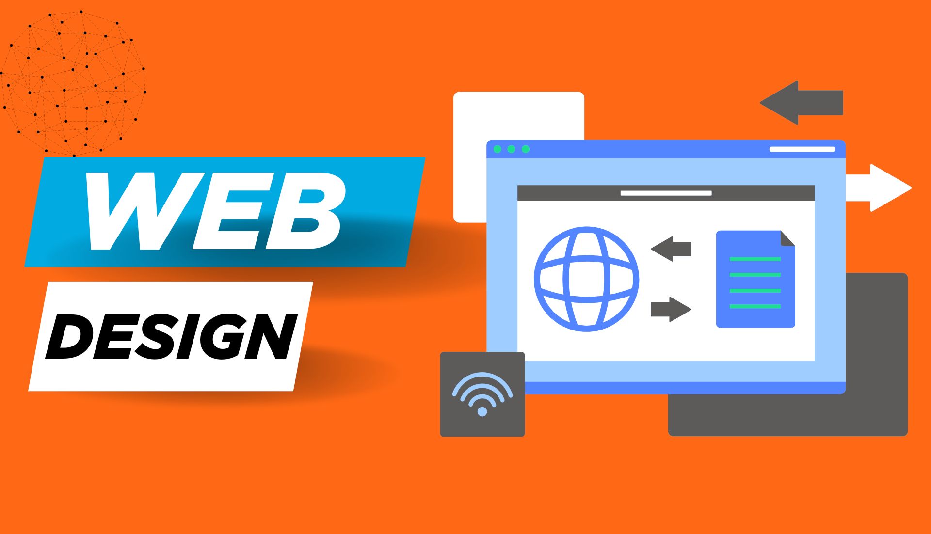
What Is Web Design?
Let’s keep it simple. Web design is how a website looks and works. It includes layout, colors, fonts, and how people move around the site. If a website is clean, easy to use, and looks great, that’s good design.
Web design means planning what goes where on a webpage. It’s picking the right colors, placing buttons, and using space well. A good design makes people feel at home when they visit your site.
Here’s an easy way to see it: Think of your website like a room. The layout is the furniture. The colors and fonts are the paint and lights. And the buttons and menus are like doors and signs that help people move around.
Now, you might ask: Is web design the same as coding? Not quite.
Web design is about the look. Web development is about the code behind it. Designers focus on what users see. Developers make sure it all works. The part users see is called the front end. The code behind it is the back end. Some people learn both and are called full-stack developers. But you can start with design, just like I did. Web design is how a website looks and feels. Web development makes it work.
Why Web Design Matters (More Than You Think)
First looks matter. That’s true in real life, as well as online. When someone visits a site, they judge it fast. In just a few seconds, they decide if they’ll stay or leave.
A good web design keeps people on your site. A bad one sends them away.
I found this out the hard way. One of my first websites looked fine to me. But users didn’t click anything. They got confused. So, I made it simpler. Clear fonts. Better spacing. Bright colors. And it worked. People stayed longer and clicked more.
Web design is not just about looks. It’s about how people feel and move around. A clean design helps people find what they need. A messy one makes them lose. If a site is smooth and easy, users feel good. They don’t notice the design, they just enjoy using it.
Think of it like walking into a room. If it’s clean, bright, and cozy, you want to stay. That’s what good design does.
Web design gives people trust. It shows that you care about their time.
If your site looks old or broken, people might think your work is too. But if it looks neat and fresh, it builds trust, even before they read a word.
So yes, web design matters. A lot. It’s the first thing people see. And often, it’s why they stay, or go.
Web Design vs. UX Design vs. UI Design
These three sound the same. But they do very different things.
Web design is how your site looks. It’s the colors, layout, and fonts. It’s what people see first.
UI design means user interface. It’s the buttons, sliders, and menus. It helps people use the site.
UX design is user experience. It’s the whole feel of the site. It guides users from start to finish.
When I made my first site, I only cared about how it looked. I used nice colors. I picked clean fonts. But users still got lost. So I learned UX. I asked, “What do users need next?” That changed everything.
- UX makes the site easy.
- UI makes it clickable.
- Web design makes it pretty.
Think of it like this:
- Web design is the room
- UI is the light switch
- UX is how easy it is to find that switch in the dark
You can start with web design. That’s what I did. Then learn UI and UX one by one. Web design shows the site. UI helps you use it. UX helps you enjoy it.
Core Elements of Great Web Design
Typography
Typography is how your words speak, without saying a word. It’s not just about choosing fonts. It’s about how easy your text is to read and how it feels to the eyes. Typography is the style, size, and spacing of your text that makes it easy to read.
When I built my first site, I picked a curly, fancy font. It looked nice to me, but it confused everyone else. Lesson learned: pretty doesn’t always mean readable.
Stick with clean fonts like Roboto, Lato, or Open Sans. Keep your body text between 16–18px. Give it space to breathe. Line height matters more than you think. Use clean, simple fonts and give them enough space to make your content readable.
Color and Contrast
Color sets the mood. It tells people how your site feels before they even read a word. Bright colors feel fun. Soft tones feel calm. Dark schemes can look sleek if done right. Good color use guides emotion and helps users focus on what matters.
Contrast is key. I once used light gray text on a white background, a big mistake. No one could read it. Always test your colors. Use dark text on light backgrounds or vice versa. High contrast between text and background improves readability and keeps visitors engaged.
Also, stick to 2–3 main colors. Too many can feel chaotic. Use your main color for actions like buttons and links.
White Space
White space is not “space.” It’s breathing room. It helps your content stand out and gives users a break. White space improves focus and makes your layout look clean and calm.
I used to cram everything onto one screen, thinking it looked “full.” But it felt heavy. Once I added space between sections, it changed the whole vibe. More relaxing, more readable. Don’t fear space. Embrace it.
Layout and Grids
A good layout makes your site feel structured, even before the content loads. Grids help keep things aligned, balanced, and easy to follow. Layouts and grids help organize your site so it’s easier to scan and navigate.
When I discovered 12-column grids in Figma, everything clicked. Things lined up better. Buttons didn’t float awkwardly. And it saved me so much time. Visitors don’t read, they scan. A clean layout helps them find what they need faster.
Imagery and Icons
A picture speaks faster than text. But it has to say the right thing. Choose images that match your message and quality. Low-res images hurt trust. Use high-quality, relevant images and icons to enhance your message and brand.
Icons help users spot actions quickly, like download, share, or delete. Just don’t overdo it. Too many icons can feel noisy. I love using free tools like Feather Icons or Heroicons. They’re clean, lightweight, and consistent.
Consistency
Consistency is invisible when it’s done right, but jarring when it’s not. Same fonts, same colors, same button styles across all pages. Consistent design builds trust and makes your site feel professional and polished.
Once, I used five different button styles on one site. It looked like five people built it. Fixing that made the whole thing feel cleaner and more “together.”
Your users shouldn’t have to relearn your site on every page. Make it predictable in a good way.
How I Learned Web Design (And How You Can Too)
I didn’t go to school for this. I didn’t even know where to start. One night, I saw a cool website and thought, “Could I build something like that?” That small spark led me here. I learned web design by doing, failing, and trying again, and you can too.
Back then, I didn’t have access to paid courses. I watched free YouTube videos. I read blog posts, some clear, some confusing. I copied website layouts just to see how they worked.
My early designs were bad. The fonts are too small. Colors are too loud. Nothing aligned. But I kept going. You don’t need to be perfect, just consistent. Learning by doing works best.
Eventually, I found better tools and clearer guides. Sites like freeCodeCamp, Frontend Mentor, and YouTube creators like Kevin Powell helped a lot.
I also made small projects, like landing pages or one-page sites. Real practice beats theory every time. Start small. Build real things. That’s how the learning sticks.
When I found tools like Figma, Canva, and Webflow, it changed everything. I could test ideas fast. I didn’t need to write code right away. I just needed to think like a designer.
You can start with free tools. Figma is great. Canva works too if you’re just getting the feel. Once you’re ready, explore Webflow or WordPress for more control. Use beginner-friendly tools like Figma and Canva to design before diving into code.
One thing I wish I knew earlier? Join a community. Reddit, Discord, Facebook groups, and talk to other learners. Ask questions. Share your work. You’ll grow faster with feedback.
And here’s my best advice: Don’t compare yourself to pros. Everyone starts at zero. Focus on making each project better than the last.
Web Design Process – From Brief to Final Design
When I got my first web design job, I felt lost. I thought I just needed to pick colors and move boxes. But I learned fast, good design needs a plan.
It all starts with the brief. That’s where I ask questions like:
“What is this site for?” “Who will use it?” “What do they need?” The brief is like a recipe. You can’t cook well without knowing the dish.
Next, I sketch a wireframe. I use pen and paper or Figma. It’s a simple map that shows where things go, like the menu, images, and text. It doesn’t need color yet. Just a layout. Think of it like drawing rooms in a house before you paint.
Then comes the fun part, choosing colors, fonts, and styles. I try to keep it simple: One main color, one accent color, and a clean font. That’s it. I use calm blues for trust, or bright tones if it’s fun. Fonts like Roboto or Lato are safe picks. Stick to 2–3 colors and clean fonts for a simple, pro look.
Once I have a design, I ask for feedback. I used to skip this, but it always helps. A friend or group can spot things I miss, like tiny text or weird spacing. I post in Facebook groups or design forums to get fresh eyes. Get feedback early. It helps you fix small things before launch.
Then I revise. Small changes make a big difference. I check spacing, fix text, and test how it looks on phones. Mobile design matters. I use tools like Figma or Webflow to make sure it fits every screen.
Here’s my simple step-by-step:
- Start with the brief
- Sketch a wireframe
- Pick colors and fonts
- Make a mockup
- Ask for feedback
- Revise and adjust
- Make it mobile-friendly
- Launch or hand it off
Follow this clear process to go from idea to live design. Design is not about being perfect on the first try. It’s about taking steps, learning, and adjusting. If you plan first, your design will look better, feel better, and work better.
Tools of the Trade
When I first started, I didn’t even know what tools designers used. I thought people just opened Photoshop and magically made websites.
Modern web design uses simple tools like Figma, Canva, and Webflow, not just Photoshop. Let me walk you through the tools I now use (and why I love them). These tools made my life easier and my work better.
Figma: My Ride-or-Die Tool
If I had to pick just one tool to design everything, it’d be Figma. It’s free, runs in your browser, and works great even on a basic laptop (yes, I used to design on a cheap one in a noisy café in Dhaka). Figma is the best free tool for beginners to design websites, even with a slow laptop.
It lets you create wireframes, full-page designs, and even clickable prototypes. You can share your work with friends or clients by just sending a link; no need to export anything.
I used Figma for my first client project. It felt scary at first, but after a few hours, I got the hang of it. Now I can’t imagine working without it.
Canva: Design Made Simple
Before I knew what UX meant, I used Canva for everything, headers, social media posts, even web mockups. Canva is a beginner-friendly tool perfect for simple designs, even if you’re not a “designer.”
It’s drag-and-drop easy. You don’t need design knowledge to get started. I still use Canva when I want to test quick color ideas or make clean visuals fast.
For folks in Bangladesh without strong PCs or Macs, Canva is gold. You can use it straight from your phone or tablet. No excuses!
Webflow: Design Meets Development
Webflow feels like magic. You design visually, but it creates real code behind the scenes. I recommend it once you’re comfortable with layouts and responsiveness. Webflow lets you design and build real websites—no coding required at first.
When I first touched Webflow, it felt like playing with LEGO blocks. I could drag elements, change styles, and see the site work instantly. It teaches you how HTML and CSS work without needing to memorize anything. Great for learning the dev side of design.
VS Code: When You Want More Control
If you ever want to go deeper and start coding your designs, Visual Studio Code is your best friend. It’s free, powerful, and used by pros. VS Code is a free, pro-level code editor used for turning your designs into real websites.
Even if you only write a little HTML and CSS, this tool gives you freedom. I used it to make landing pages and tweak WordPress themes for clients.
Adobe XD & Sketch: Honorable Mentions
Some designers use Adobe XD or Sketch. I’ve tried both, and they’re solid. But Figma won my heart because it works on any device and doesn’t need a Mac or an expensive subscription. Adobe XD and Sketch are solid, but Figma is better for beginners due to its free, cross-platform features.
If you’re working in a team that uses XD, that’s fine. Just don’t feel like you have to use it. Pick what works for you.
Website Builders: Fast and Visual
Sometimes you don’t need to code at all. Tools like Wix, Squarespace, or WordPress with Elementor help you drag and drop your way to a full site. Website builders like Wix or WordPress make it easy to launch a site without writing code.
I used Elementor for my first freelance job. It saved me hours. Just install, drag, tweak, and publish. For clients who just want something simple, this is often enough.
Tips for Beginners in Web Design
When I first started, I had no clue what I was doing. I thought I needed fancy tools or a design degree. But I didn’t. I just needed to try.
1. Focus on People, Not Just Pretty Things
Good design is not about cool colors or effects. It’s about helping people. Can users find what they need? Can they use the site with ease? Good web design solves problems. It’s more than just looks.
Think like a visitor. If the site feels easy and clear, you’re on the right track.
2. Start Small with Fun Projects
I made a fake site for a coffee shop, just for fun. It had no real use, but I learned so much from it. Build practice sites. That’s how you learn best.
Try a one-page blog, a landing page, or a fake brand. Play with ideas. Learn as you go.
3. Don’t Chase Trends Too Fast
Trends change fast. One day it’s glassmorphism, the next it’s minimal. I once added cool effects but forgot to fix the font. The site looked fun, but no one could read it. Learn the basics first. Trends come later.
Stick to clean fonts, good space, and clear layouts. Master the core. Then explore trends.
4. Join Online Groups
I joined a Facebook group full of new designers. At first, I just watched. Later, I posted my work and got real help. Join design groups for tips, feedback, and support.
You’ll grow faster with others around. Reddit, Discord, and Facebook all have great groups.
5. Watch Less, Do More
I watched a lot of videos at first. But I didn’t learn much until I made things on my own. Practice is better than just watching.
After each video, pause. Try to build what you saw. That’s how you remember it.
6. Use Free, Simple Tools
I used Figma and Canva on a low-end laptop. They worked just fine. You don’t need big apps to start. Tools like Figma and Canva are great for beginners.
Even on a phone or an old PC, you can design well. Focus on ideas, not gear.
7. Don’t Compare Your Start to Others’ Finish
I saw designers on Twitter with perfect work. I felt like I’d never catch up. But I kept going. With each project, I got better. Everyone starts at zero. Just improve step by step.
Your work won’t be perfect now. And that’s okay. What matters is that you keep going.
8. Save Designs You Love
I take screenshots of websites I like. I keep them in a folder. When I feel stuck, I look at them for ideas. Save good designs to get inspired later.
Call it a swipe file. It’s like a design mood board. It helps a lot.
9. Design for Phones First
Most users browse on phones now. I once built a site that looked great on a laptop, but it broke on mobile. Always check how your site looks on phones.
Use tools like Figma’s phone frames. Test often. Mobile design is key.
10. Share Your Work
I was scared to share my work online. But the feedback helped me grow. People saw things I missed. Post your designs. Feedback will help you improve. Don’t wait until it’s perfect. Share now. You’ll get better faster.
Final Thoughts: Why I Still Love Web Design
I still remember the night I made my first website. It was ugly. The fonts didn’t match. The layout broke on mobile. But I felt proud. That was my site. I made something from scratch, and it worked (kind of).
What I love most about web design is the freedom. You can go from an idea in your head to a real thing on the internet. It’s creative. It’s visual. And it solves real problems for real people. Web design lets you create, help others, and grow all at once.
Some days I feel stuck. A design won’t click. A client wants ten changes. My laptop crashes. But even on bad days, I don’t want to quit. I just close my tabs, take a break, and come back later. That’s how I’ve stayed in love with it.
It’s normal to feel stuck. Take breaks, then come back stronger. The internet keeps changing, new tools, new styles, new trends. But the heart of design stays the same: make things clear, useful, and kind to the eyes. That’s all.
Trends change, but great design is always about clarity and care. If you’re just starting, I get it. It’s hard. You might feel lost. You might compare your work to others. But please don’t stop. Even pros mess up. The trick is to keep going.
Don’t compare yourself. Just keep learning, one small win at a time. Design gave me a way to express myself. It opened doors I never knew existed. Jobs, friends, side projects, it all started from learning how to move boxes and pick fonts.
Web design can change your life, one layout at a time. So if you’re wondering, “Is this worth learning?”, my answer is yes. A loud, full-hearted yes. Because web design isn’t just a skill. It’s a superpower. Yes, web design is worth it. It’s creative, useful, and opens real opportunities.